THE PSYCHOLOGY OF COLOR IN INTERIOR DESIGN AND HOW IT SHAPES HOW YOU FEEL
Most people choose paint colors based on what looks good in a showroom or matches their furniture. Few stop to consider what those colors are actually doing to their nervous system every single day. Yet research in environmental psychology consistently shows that the colors surrounding us influence mood, energy, stress levels, sleep quality, productivity, and even appetite in ways that go far deeper than aesthetics.
Color is not decoration. It is a tool. And understanding how to use it may be one of the most accessible and underutilized levers for improving how a space makes you feel.
Why Color Affects Us the Way It Does
The relationship between color and emotion is not simply cultural or subjective. It is biological. Color psychology operates on subconscious levels rooted in neuroscience and evolutionary biology that explain how the brain is hardwired to respond to different wavelengths of light.
When the eye perceives color, the brain does not simply register it as a visual input. It triggers a cascade of neurological responses. Colors are not just visual stimuli — they activate physiological reactions that can alter heart rate, blood pressure, and hormone levels. This is why the impact of a space's color scheme can be felt even without conscious awareness of it.
The distinction between warm and cool tones forms the foundation of color psychology in design. Warm colors such as reds, oranges, and yellows tend to stimulate and energize, while cooler tones like blues and greens have a calming effect that promotes relaxation and focus. These responses are deeply ingrained in human psychology and can be used strategically to shape how a space functions.
The Individual Colors and What They Do
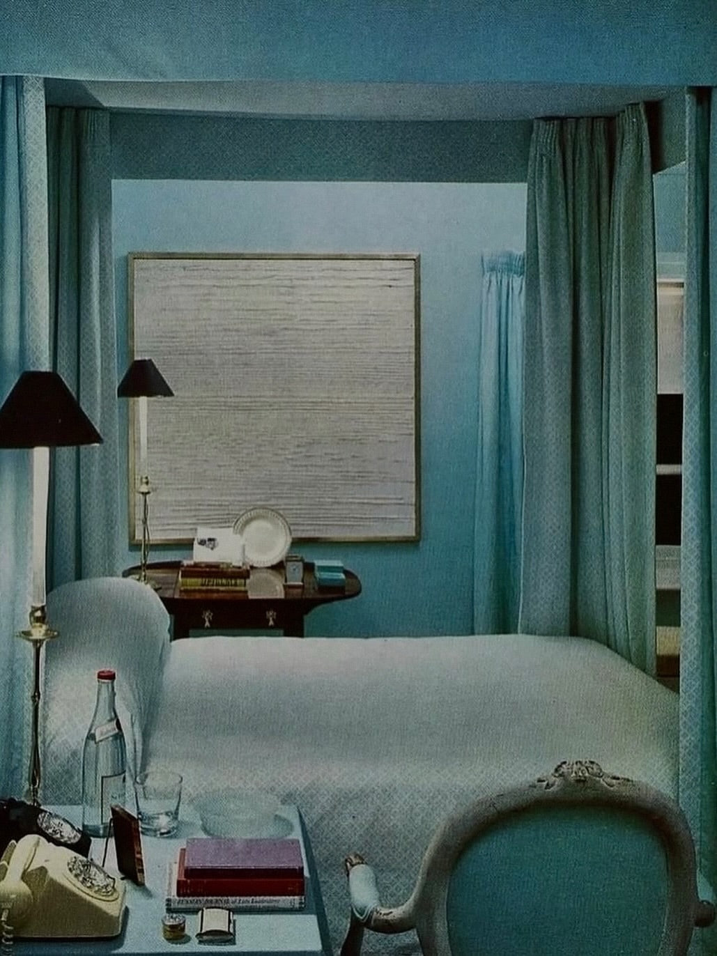
Blue: Blue is one of the most researched and consistently impactful colors in interior design. Studies in environmental psychology link cooler tones like blue to calmness and concentration. Research suggests that people in blue rooms tend to get more sleep, as the color helps lower blood pressure and promotes a sense of peace and serenity. Blue surroundings are also associated with boosted productivity, making them a strong candidate for both bedrooms and home offices.
Lighter shades of blue such as sky blue or soft powder create an airy, open feeling. Deeper shades like navy add sophistication and depth. The key is matching the shade to the intended function of the space.
Green: Green is the color the human eye can perceive more shades of than any other, making it uniquely versatile in interior design. It represents nature and carries a soothing, refreshing effect in interior spaces. Research from the University of Texas indicates that green stimulates creativity, making it an ideal choice for artistic spaces, studios, and brainstorming areas.
Green is increasingly popular in wellness spaces and workplaces alike, where the goal is an environment that reduces stress while maintaining alertness. Its connection to the natural world also makes it a cornerstone of biophilic design, which aims to bring the restorative qualities of nature indoors.
Red: Red raises the heart rate and stimulates appetite, which is why it is so frequently found in restaurant and dining spaces. It evokes passion, vitality, and energy, and tends to encourage activity and conversation. In interior design, red is best used in moderation — as an accent wall, statement furniture, or through textiles — rather than as the dominant color of a room.
Excessive use of red in restful environments like bedrooms can lead to overstimulation, anxiety, and difficulty sleeping. Deep muted reds such as terracotta or burgundy can soften this effect while maintaining warmth and character.
Yellow: Yellow is associated with sunshine, optimism, and mental energy. It can promote creativity and make small spaces feel larger and more cheerful, which is why it works particularly well in kitchens, hallways, and children's rooms. However, an entirely yellow room can become overwhelming over time and in some cases may raise blood pressure when used in excess. Vibrant, warm-toned yellows are more effective than dull or greenish shades, which can evoke unease.
Orange: Orange radiates enthusiasm, creativity, and social warmth. It makes communal areas feel more engaging and stimulates both appetite and conversation, making it suitable for kitchens, dining areas, and creative workspaces. Like red, it is energizing and best used with restraint in spaces meant for rest. In bedrooms specifically, orange can interfere with the body's ability to wind down and should be reserved for accents or avoided altogether.
Purple: Purple sits at the intersection of passion and calm, combining the energy of red with the serenity of blue. Darker purples are associated with luxury, creativity, and depth. Lighter shades such as lavender carry a restful quality that works well in bedrooms and meditation spaces. Purple in its various forms is one of the more psychologically complex colors in interior design, capable of creating anything from dramatic intimacy to gentle tranquility depending on the shade and context.
White and Neutrals: White and light neutrals create a sense of space, cleanliness, and openness. Research consistently links lighter colors to improved psychological functioning and a greater sense of calm. However, stark overuse of white can feel sterile or cold. The most effective neutral palettes layer warm whites with natural textures, soft grays, and earthy tones to create spaces that feel clean without feeling clinical.
Applying Color Psychology Room by Room
Bedroom: The bedroom's primary function is rest and recovery, which means the color palette should support relaxation and sleep quality. Cool, calming colors like soft blue, muted green, and lavender are among the most effective choices. Bold, high-energy colors such as red, bright orange, or intense yellow can interfere with the body's ability to prepare for sleep and are best avoided as dominant hues. Warm neutrals can provide flexibility and intimacy while still supporting rest.
Home Office: A home office benefits from colors that support sustained focus without creating tension. Blue is consistently associated with productivity and concentration. Green offers a balance of alertness and calm that reduces eye strain over long periods. Accents of orange or warm yellow can introduce creative energy without overwhelming the space. Avoid colors that are either too stimulating or too subdued — the goal is sustained, relaxed focus.
Kitchen and Dining Spaces: Warm tones perform well in kitchens and dining areas because they stimulate appetite and encourage conversation. Yellow and orange introduce energy and warmth, while touches of green can balance the vibrancy and bring a fresh quality to the space. Red used strategically as an accent, rather than a dominant wall color, can also enhance the social, appetite-stimulating qualities of a dining environment.
Living Room: The living room is a transitional space that serves many functions — relaxation, social gathering, entertainment, and sometimes work. A neutral base of warm creams or taupes anchored by richer accent colors such as deep green, ochre, or soft terracotta tends to create an environment that feels both inviting and versatile. The goal is warmth and openness rather than stimulation or excessive calm.
Bathroom: Bathrooms benefit from palettes that feel clean, restorative, and spa-like. Soft pastels, cool whites, and ocean-inspired hues create a sense of sanctuary. Overuse of stark white can feel sterile rather than soothing — softening with warm wood tones, natural stone, or muted sage greens adds depth while preserving the refreshing quality the space demands.
Color, Circadian Rhythm, and Sleep
One of the more nuanced findings in recent research involves the relationship between color, light, and the body's internal clock. A 2025 study found that cooler hues such as blue may have an unfavorable effect on circadian rhythm at night, particularly in spaces used during evening hours. While blue is widely recommended for bedrooms from a psychological standpoint due to its calming associations, physiologically it may interfere with the body's natural wind-down process when paired with artificial lighting.
This finding highlights an important distinction: the time of day a space is most used matters as much as its function. Evening spaces may benefit from warmer, amber-toned palettes that support the body's natural melatonin production rather than cooler hues that may suppress it.
Saturation, Tone, and the Details That Matter
Color psychology is not simply about choosing blue over red. Saturation, tone, and shade dramatically alter the psychological effect of any given color. A muted sage green behaves very differently from a saturated lime. A deep navy creates a completely different atmosphere than a pale powder blue. These nuances mean that color selection in interior design is not a one-size-fits-all exercise — it requires understanding not just the hue but the full character of the color and how it interacts with the light, size, and function of the specific space.
The Bigger Picture
The walls, ceilings, and surfaces of a space are not neutral. Every color choice either supports or undermines the experience of the people living or working within it. By understanding how color influences the nervous system, productivity, rest, and emotional state, it becomes possible to design spaces that are not just visually appealing but genuinely supportive of health and wellbeing.
Color is one of the most immediate, impactful, and accessible tools in design. Used with intention, it transforms a space from something you simply occupy into something that actively works for you.
Scientific Sources
- International Journal of Recent Advances in Psychology and Psychotherapy. The Influence of Colours on Well-Being: Psychological and Physical Health. 2026.
- MDPI Buildings. Psychology or Physiology? Choosing the Right Color for Interior Spaces to Support Occupants' Healthy Circadian Rhythm at Night. 2025.
- Humanities and Social Sciences Communications. Impact of Interior Design Factors on the Physical, Physiological, and Mental Health of Older Adults. 2025.
- Natalie Holden Interiors. The Influence of Colour Psychology on Interior Design. 2025.
- ArchiVinci. Color Psychology in Interior Design. 2025.
- University of Texas Research via Sound Painting Solutions. The Impact of Paint Colors on Mood and Room Perception. 2025.
- World Journal of Advanced Research and Reviews. Colour Psychology in Interior Design for Geriatric Spaces. 2024.
- Rethinking the Future. Interior Design: Color Theory and Psychology. 2023.
- Image: unknown.
BY Self Maximized